Joined: 30 Mar 2008 Last Visit: 30 Apr 2012 Posts: 12
Posted: Sun Mar 30, 2008 6:43 am Post subject: OD&D Fonts: OCE 6th edition
About a month or so ago, I decided to decode the OD&D books. I started with the OCE 6th print, since that's the one I have a copy of (I believe I have a 4th ed. long stored up in my folks house which I haven't looked at in 20 years. I certainly hope I do, as 4th was the last print with the older font layout.)
I launched form the known font sites (http://www.geocities.com/rgfdfaq/tsrfonts.html and http://mystara.thorf.co.uk/fontfaq.php), I was able to get ONLY the title (Dungeons & Dragons) font, which everyone seems to know and the Futura lead eventually got me the Bylines/booklet/company info on the cover and copyright page.
After that, it was a lot of using http://www.identifont.com and http://www.myfonts.com's what the font and many other typographic sites and font sites to look at fonts and narrow it down until I found the exact right font.
Last edited by Busman on Wed Apr 16, 2008 12:42 am; edited 2 times in total
Joined: 30 Mar 2008 Last Visit: 30 Apr 2012 Posts: 12
Posted: Sun Mar 30, 2008 7:21 am Post subject: OCE Cover(s)
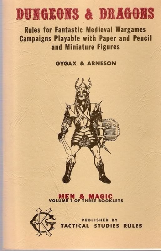
This post will cover the fonts of the covers of the OCE books, specifically the Men & Magic cover used as reference.
The elements:
Dungeons & Dragons Quentin EF
(sometimes known as Quentin Caps as well)
Interestingly, Elsner+Flake wasn't formed until 1986, so this can't be the actual font used by TSR at the beginning. It could be a digitized version of the font they used, but I haven't found it yet. I suspect it's more likely that it was originally actually something similar to URWoodTypD but done with both the font and an outline of the font. Something that todays DTP programs have a hard time doing.
-----
Rules for Fantastic... Franklin Gothic Medium Extra Condensed *UPDATED*
I'm still a smidge iffy on this one, I'd say 90% likely, but it is certainly in the ITC Frankin Gothic Family. It seems spot on from my screen and print outs, but I want to print onto some clear sheets and make sure I've nailed it before I say 100%. The only question here is the weight of the font, I know it's a Condensed version of Franklin Gothic. It may not be Medium Condensed in Bold, maybe there is a Condensed Bold font that I didn't find that was actually it. But it's REALLY close if it isn't it.
*UPDATE* (12APR08): It appears to be an Extra Condensed version of Franklin Gothic. I'm trying to decipher if it's Elsner+Flake, Monotype or Adobe version of this font. I'm leaning EF right now.
-----
MEN & MAGIC ITC Franklin Gothic Std-Hvy
(also known as ITC Franklin Gothic Std Med)
95% likely. I'd say 100%, but until I see it on clear print over my actual cover, there are so many variations in the Franklin Gothic family that it could be something very similar to this one. I'd bet a lot of money this was it.
-----
GYGAX & ARNESON
VOLUME 1 OF...
PUBLISHED BY
TACTICAL STUDIES RULES Futura Book-Bold
99.9% likely. Again, a lot of variants in Futura font family, but when I found this one, all of the little things that had been bugging me about earlier choices went away.
-----
I've got a recreated cover in Word that looks basically spot on with font sizes, etc. worked out, but I'm not sure how kosher putting a link to that would be. Nor am I 100% comfortable with printing out all of the font sizes, kerning, line height, and leading information that it takes to make a dupe cover.
Last edited by Busman on Wed Apr 16, 2008 12:46 am; edited 6 times in total
Joined: 30 Mar 2008 Last Visit: 30 Apr 2012 Posts: 12
Posted: Sun Mar 30, 2008 7:31 am Post subject: OCE Copyright Page
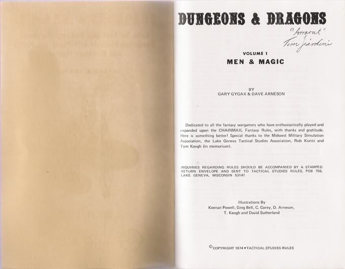
This post will cover the copyright page of the OCE Books, specifically the Men & Magic book, used as an example.
New elements:
Volume 1 Futura Book-Bold
99.9% likely. A reprise from the Volume font from the Cover.
-----
BY GARY GYGAX & DAVE ARNESON
Dedicated to all...
INQUIRIES...
Illustrations By...
COPYRIGHT... Univers LT Std 55 (sorta)
99.9% likely. This font is the font used for 90+% of the book*. This page was instrumental in cracking which font it was, too. Specifically, it was the capital Q in INQUIRIES that opened the door. It was the that funky tail that allowed me to isolate this font. After that, it was just a matter of find the right font size and weight for each of the elements to get my document matching up.
EDIT: Adobe carries this font under the title Univers and Linotype carries it under the moniker Univers 55 Roman or Univers LT 55 Roman, though I can't find a difference between the LT and non-LT versions yet. It may be something in total number of characters carried in the font or some kerning pairs I haven't found yet. I would assume it has something to do with it being a LinoType font, but Linotype offers both an LT and non-LT version. Maybe the LT is a version they created in-house off of the original versions.
EDIT (cont.) Also, I'm noticing some kerning issues with the numbers for this font, specifically: 10 and 11. It almost looks like TSR had some sort of monospaced version of the numbers that they used. I'll look further into this as time permits.
*See interior text post for more info
Last edited by Busman on Mon Apr 07, 2008 7:31 am; edited 5 times in total
Joined: 30 Mar 2008 Last Visit: 30 Apr 2012 Posts: 12
Posted: Sun Mar 30, 2008 7:41 am Post subject: OCE Books Index Page
OCE Books Index Page
Don't have a scan to link to this here yet.
Only new element:
INDEX unknown
I still haven't cracked this yet. I've got a lot of close calls, but I haven't found the 100% correct font yet. It's a bizarre one, it has brackets on the serifs, except on the E, which also has the odd longer base line than it's top line.
Some variation or similar font to Cheltenham is my leading contender right now. Cheltenham is a very old font, which I'm sure has been an inspiration for many fonts in the last 100+ years.
Having only 5 capital letters to work with makes this one a little tricky to nail down.
Last edited by Busman on Wed Apr 16, 2008 12:47 am; edited 2 times in total
Joined: 30 Mar 2008 Last Visit: 30 Apr 2012 Posts: 12
Posted: Sun Mar 30, 2008 7:46 am Post subject: OCE Foreward Page
This post covers the Foreward page of the Men&Magic book of unknown print runs.
My physical copy does not have this element in it. But, I've seen a few scans that do, including the PDF that is sanctioned by WotC that you can find at RPGnow.com, ENWorld.org and other sites that sell legal PDFs.
Need a good scan of this page
New element:
Forward unknown
Since my physical copy doesn't have this, I don't have anything to confirm this 100% against, so I'm not sure if all of the scans I've seen (most of which are OCR'd) are working from the same flawed information, or if there really was a print or number of prints that had this element in it. If it gets confirmed, then I'll gladly go looking for it.
Joined: 30 Mar 2008 Last Visit: 30 Apr 2012 Posts: 12
Posted: Sun Mar 30, 2008 7:52 am Post subject: OCE Interior Text (Main Body)
Excepting the word INDEX and Forward[sic] (in some prints?), everything after the halfway down the copyright page and until the catalog page is a single font:
Univers LT Std 55 (sorta) See post below.
-----
Pg 8 last two paragraphs: Halflings: ... and Other Character...
Pg 23 the entire paragraph of Hold Portal: ... Univers Bold
The version of this font I have is from Hewlett Packard from one of their printer CDs, but it's an exact match. It varies slightly from the Univers LT Std 55 that is in the rest of the books. I'm trying to find the official version from a fonts site that matches this, so I can more definitively nail it down.
There are probably other instances of this font in books 2 and 3 replacing elements form when they didn't just remove infringing text from the later prints. I'll place them here when I find them. Also, I have some suspicions that there are single words and maybe even characters replaced with this font, but those don't stand out quite as much as these whole paragraphs.
If someone has a suggestions for a good file hosting site, I'll put a PDF up of the page 18-19 I've recreated using this font. It's watermarked, so I'm hoping it won't get widely distributed for people other than for research purposes, which is my intention for this entire endeavor.
Last edited by Busman on Sun Apr 13, 2008 6:48 am; edited 3 times in total
Joined: 30 Mar 2008 Last Visit: 30 Apr 2012 Posts: 12
Posted: Sun Mar 30, 2008 8:00 am Post subject: OCE Catalog Page
As far as I can tell, this page consists of the same single font at various sizes.
new element:
Other Fantasy Releases... Century in normal and bold weights (now called Century Old Style) *UPDATED*
Again, I haven't nailed this one down, which is odd, since I have basically all of the letters upper and lower case to work with, but it's been tough finding an exact match. Bookman is close but there are differences, but it's the closest one across the board so far. I'm still digging around for this one. I go back and forth between this and the INDEX font each night looking for new leads and hoping to find an exact match. Nothing thus far. The oddest element is the large round bulb on the lowercase r that seems fairly unique.
*UPDATED* 15APR08: This is definitely a version of Century. Exactly which version you can find today that is an exact match, I'm not sure. The EF version is a near perfect match, the only issue is that the horizontal serifs on the lower case "r", "l", "n" and other letters have are perfectly horizontal in the TSR font, but slopes/curves down in the modern redo of the old style of font. I'll continue to look for something that is a 100% match.
Last edited by Busman on Wed Apr 16, 2008 9:51 am; edited 3 times in total
Joined: 30 Mar 2008 Last Visit: 30 Apr 2012 Posts: 12
Posted: Sun Mar 30, 2008 8:03 am Post subject: OCE Interior Covers
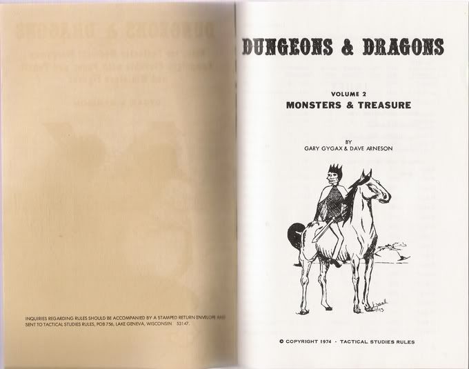
The interior covers of Books 2 and 3 have a new element in them contained in the Men & Magic Book on the copyright page, but in a different font.
new element:
INQUIRIES... Futura Std Medium *UPDATED*
I haven't started looking into this yet, as the M&M has been my focus of concentration for the last month or so, thus far. At first blush, based on my dealings with other TSR products it looks like some form of Helvetica.
*UPDATE* 12APR08: Turns out it's our good friend Futura. Also note that the byline and other information on the copyright page of Monsters & Treasure is Futura as well, and not updated to Univers as was the Men & Magic copyright page. The uppercase G's are a good indicator, in Universe they are flat from the bar down to where the curve begins; in Futura they are round all the way through to the bar, there is no vertically straight portion.
Last edited by Busman on Sun Apr 13, 2008 6:55 am; edited 3 times in total
Joined: 30 Mar 2008 Last Visit: 30 Apr 2012 Posts: 12
Posted: Sun Mar 30, 2008 8:06 am Post subject: OCE Reference Sheets
I haven't started on these yet. I may do them in a different thread, as they seem to be a mix of the old font (pre-5th ed) and Univers used in the rest of the books when they reset the books.
Joined: 30 Mar 2008 Last Visit: 30 Apr 2012 Posts: 12
Posted: Mon Apr 07, 2008 7:12 am Post subject: Issues with Univers LT Std 55, Univers Light, Univers etc.
In one of my edits above I mention that there were some kerning issues with 10 and 11 and some other things. I also mention that I have a couple of versions of Univers from my old Hewlett Packard printer CDs.
On this CD not only do I have Univers Bold, simply called Univers in my font selection in word, but also Univers Light-Bold, simply called Univers-Light in my font selection.
I originally hit gold with Univers-Light when I discovered it was Univers font from the front copyright page. The problem was that my version of Univers-Light would allow me to bold version items, so I was left using a bastard version of Univers-Light and Univers for the bold sections. The spacing of the two fonts was all off and it really bugged. Then I tested out Univers LT Std 55 and it was a near perfect match for Univers-Light and had the benefit of being a nice modern day font and allowed bolding and italicizing and all that fun yumminess.
Turns out that the kerning of the 10 and 11 continued to eat at me, however. Just tonight I also discovered that the ' and '' (expressed as two ' and not a actual ") are also incorrect on my new fangled font. Which was simply too much to bear.
So, I've got a new Frankenstein version that has Univers-Light for all but the bold portions of the text and then using the much more closely matched Univers LT Std 55 for the bolded portions. I'll see how close this gets me.
That said, this is most assuredly NOT how TSR did it back in the day, as Linotype wasn't in control of the Univers font until at least 1985 or later.
Though I'm learning more and more each day about typesetting etc. I'm not 100% knowledgeable about techniques, yet; especially from the early 70s.
Additional note (which I'll move elsewhere sometime in the far future): I got a look at a 4th edition which had the previous font (and alot of the early SR type as well), and it's as I suspected, it's the same as it is in the Reference sheets. It appears to be Futura, most probably the standard generic weight, etc.
I need to do some more research into the initial versions in the very early days of TSR because I have a very distinct memory of Gary or someone talking about the process of how they got stuff typeset back in those days. I'm not sure I'll be able to recapture the shaky, really offbeat typesetting of those first versions; we'll see though.
You cannot post new topics in this forum You cannot reply to topics in this forum You cannot edit your posts in this forum You cannot delete your posts in this forum You cannot vote in polls in this forum